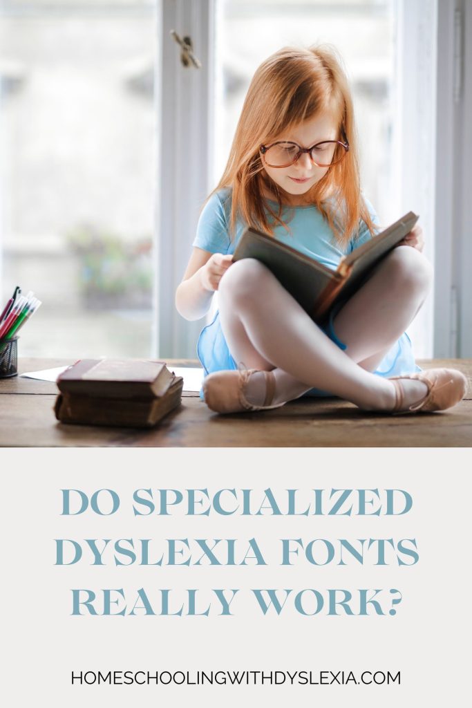
As awareness of dyslexia has grown, so too has the development of tools to support those with dyslexia, one of which is specialized dyslexia fonts. These fonts are designed to make reading easier for individuals with dyslexia, but how effective are they? In this post, we’ll explore what dyslexia fonts are, when they were developed, and the current research on their effectiveness.
What Are Dyslexia Fonts?
Dyslexia fonts are typefaces specifically designed to reduce the challenges dyslexic readers face when reading text. These fonts are created with certain features that aim to increase readability and decrease the likelihood of letter confusion, which is a common problem for people with dyslexia.
Key features of dyslexia fonts often include:
- Heavy baselines: Letters have thicker bottoms, giving them a gravity-bound appearance that helps prevent letters from flipping or rotating.
- Distinctive letter shapes: Letters are designed to look unique from each other, reducing the chance of confusing similar-looking characters like ‘b’ and ‘d’ or ‘p’ and ‘q.’
- Increased spacing: Both letter and word spacing is often wider in dyslexia fonts, reducing the visual crowding that can overwhelm dyslexic readers.
- Asymmetrical characters: Letters are often asymmetrical, which prevents them from being easily flipped or mirrored, helping dyslexic readers distinguish between different letters.
A Brief History of Dyslexia Fonts
The concept of dyslexia fonts is fairly recent, with the most well-known fonts being developed in the early 2000s. The first widely recognized dyslexia-friendly font is Dyslexie, created by Dutch designer Christian Boer in 2008. Boer, who has dyslexia himself, designed Dyslexie to tackle the specific difficulties he experienced when reading.

Another popular dyslexia font is OpenDyslexic, developed by Abelardo Gonzalez in 2011. OpenDyslexic was created as an open-source font, making it freely available to anyone who would gain from it. Gonzalez’s goal was to offer an accessible tool that could be used by individuals and educators without the barrier of cost.

Since the development of these fonts, they have been widely adopted in various educational tools, websites, and reading applications. The hope is that by making text more accessible, dyslexic readers will have a better experience and potentially improve their reading skills over time.
Do Dyslexia Fonts Really Work?
The effectiveness of dyslexia fonts has been a topic of debate among researchers and educators. While these fonts are designed with specific features intended to aid dyslexic readers, the scientific evidence supporting their efficacy is mixed.
Some studies suggest that dyslexia fonts can improve reading speed and reduce errors for some individuals with dyslexia. For example, a 2012 study by Rello and Baeza-Yates found that participants with dyslexia read faster and made fewer mistakes when using the OpenDyslexic font compared to standard fonts like Arial.
However, other research challenges the effectiveness of these fonts. A study published in the journal Annals of Dyslexia in 2013 found no significant improvement in reading speed or accuracy when dyslexic readers used Dyslexie compared to a standard font. Similarly, a 2016 study by Kuster and colleagues found that while dyslexic readers expressed a preference for the Dyslexie font, it did not lead to a measurable improvement in reading performance.
These mixed results suggest that the effectiveness of dyslexia fonts may vary from person to person. While some dyslexic readers may find these fonts helpful, others may not experience significant benefits. It’s important to recognize that dyslexia is a highly individualized condition, and what works for one person may not work for another.
Should You Use Dyslexia Fonts?
Given the mixed evidence, whether or not to use a dyslexia font ultimately comes down to individual preference and experience. If you or your child has dyslexia, it may be worth experimenting with dyslexia fonts to see if they help improve readability and comfort when reading.
It’s also important to remember that dyslexia fonts are just one tool in a broader toolkit for supporting dyslexic readers. Other strategies, such as using assistive technology (like text-to-speech software), employing multi-sensory learning approaches, and providing additional reading support, can be equally or more effective in helping dyslexic individuals succeed.
Specialized dyslexia fonts are a fascinating and well-intentioned tool designed to make reading easier for those with dyslexia. While they have helped some dyslexic readers, the research on their effectiveness remains inconclusive.
Ultimately, the decision to use a dyslexia font should be based on personal experience and preference. By combining dyslexia fonts with other supportive strategies, we can create a more inclusive reading environment that caters to the diverse needs of dyslexic individuals.
If you’ve had experience with dyslexia fonts, whether positive or negative, sharing your story can help others in the community make informed decisions about whether to use these tools.
Let us know in the comments below if a specialized dyslexia font has worked for you or your family.


0 Comments